


TL;DR
- Bubbles give you flow at a glance… size = market cap, colour = performance.
- Heatmaps show breadth… which sectors are driving moves.
- Dominance frames rotation… BTC.D, ETH.D, and sector splits reveal where capital is shifting.
What you’ll learn
- How to read bubbles, heatmaps, and dominance without overthinking it.
- A 5-minute routine to stay oriented and avoid chasing noise.
- Common misreads that cost money… and how to avoid them.
Introduction
Dashboards don’t make decisions for you… they keep you oriented. Used right, bubbles, heatmaps, and dominance charts tell you where things are moving and how broadly they’re moving. That’s enough to decide whether to sit tight, rotate, or stand aside.
Bubbles… the fastest scan
What it shows
- Size tracks market cap… bigger bubbles are larger assets.
- Colour shows performance over your chosen window… green up, red down.
- Some tools cluster by sector for quick theme reads.
How to use it
- Start with the daily view… flip to weekly to check if moves have legs.
- Note top winners and losers… see if winners cluster by sector or theme.
- Click a bubble to check volume, recent range, and whether the move is new or just mean reversion.
What to avoid
- FOMO on a bright-green microcap with thin volume.
- Treating one green day as trend… always cross-check the weekly.
Heatmaps… breadth in one look
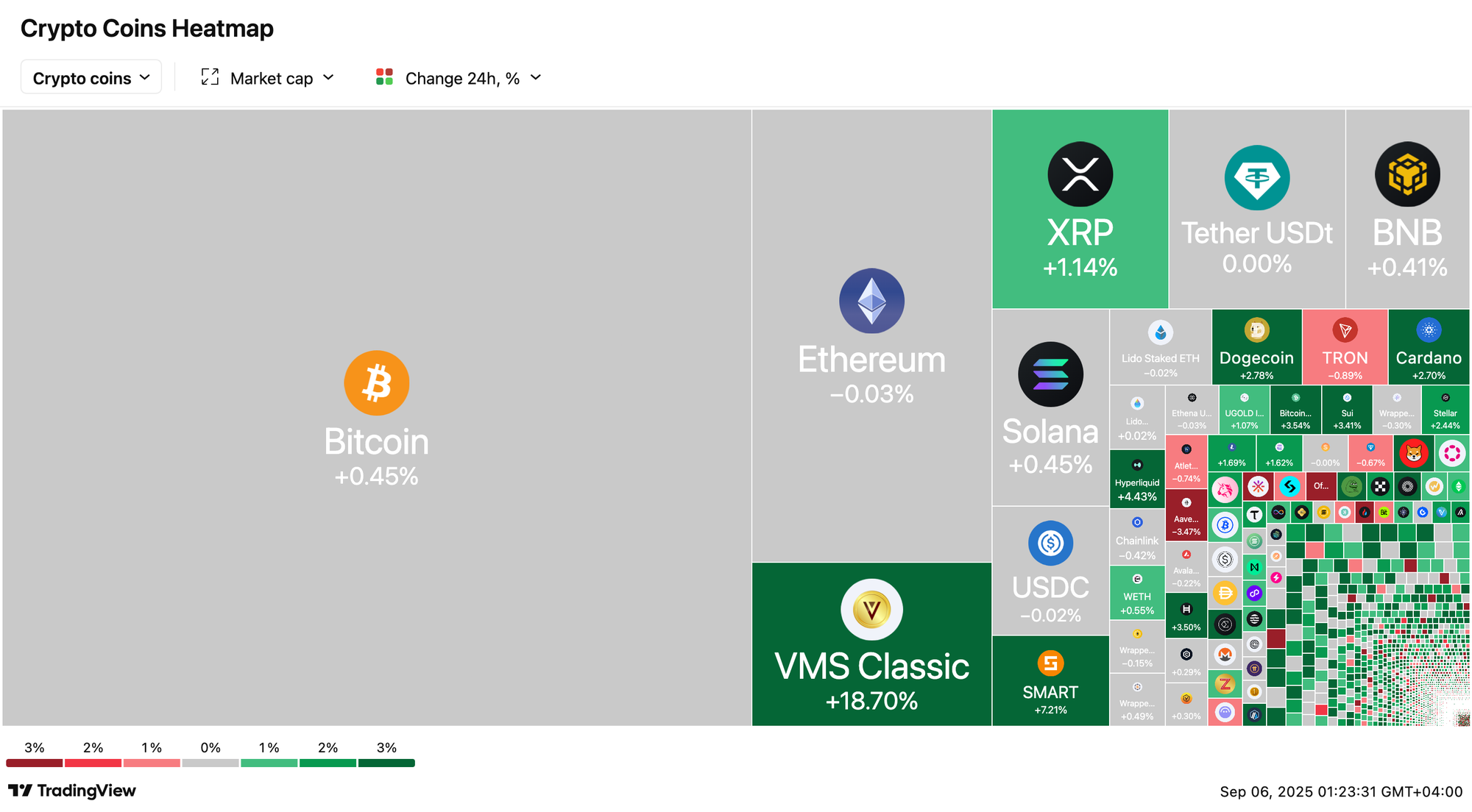
What it shows
- A wall of tiles coloured by performance… often grouped by sectors or ecosystems.
- Quick way to answer… is this a market move or just a handful of coins.
How to use it
- Scan sector blocks… are L2s green while DeFi is flat, or is it blanket green.
- Compare cap tiers… are majors leading or only small caps moving.
What to avoid
- Overweighting thin sectors… a few tiny tiles can skew perception if you ignore market cap.
Dominance… reading rotation

What it shows
- BTC.D and ETH.D give the backdrop… rising BTC.D usually means alt headwinds… rising ETH.D often precedes broader alt participation.
- Sector dominance helps gauge where flows are rotating… AI, DeFi, L2s, infra.
How to use it
- If BTC.D is rising and bubbles are mostly red for alts… stick to BTC or reduce alt risk.
- If ETH.D is turning up and ETH pairs stabilise… plan for staged alt rotation, not a single-day flip.
- Map this to your watchlist… favour sectors showing breadth plus follow-through.
Your 5-minute daily workflow
- Open bubbles (daily)… mark top winners/losers and any sector clustering.
- Flip to weekly… confirm if today’s leaders also lead on the week.
- Check heatmap breadth… broad or narrow.
- Glance at BTC.D and ETH.D… note direction vs yesterday.
- Decide action… hold, rotate small size, or wait for confirmation.
Risks and misreads
- Chasing single prints… one bright bubble isn’t a trend.
- Ignoring dominance… alt rallies under rising BTC.D often fade.
- Forgetting liquidity… tiny caps move hardest but slip quickest; size accordingly.
- Timeframe mismatch… don’t trade weekly conclusions off a 1-hour view.
Mini FAQ
Which timeframe is best for bubbles?
Daily first… then weekly to confirm follow-through.
How does dominance help day to day?
It sets the backdrop… if BTC.D is rising, alt longs need tighter risk or smaller size.
What’s a simple invalidation for rotation?
If ETH.D stalls and BTC.D re-accelerates while your alt-sector heatmap turns mixed… step back and reassess.
Resources
- Your Crypto Bubbles explainer page for newcomers.
- Member tool… Bubble Rotation Map to track BTC.D, ETH.D, and sectors side by side.
If this helped you get oriented… join Alpha Insider for weekly rotation checklists, timing windows, and member videos. Less noise… clearer plans… better positioning.


Discussion