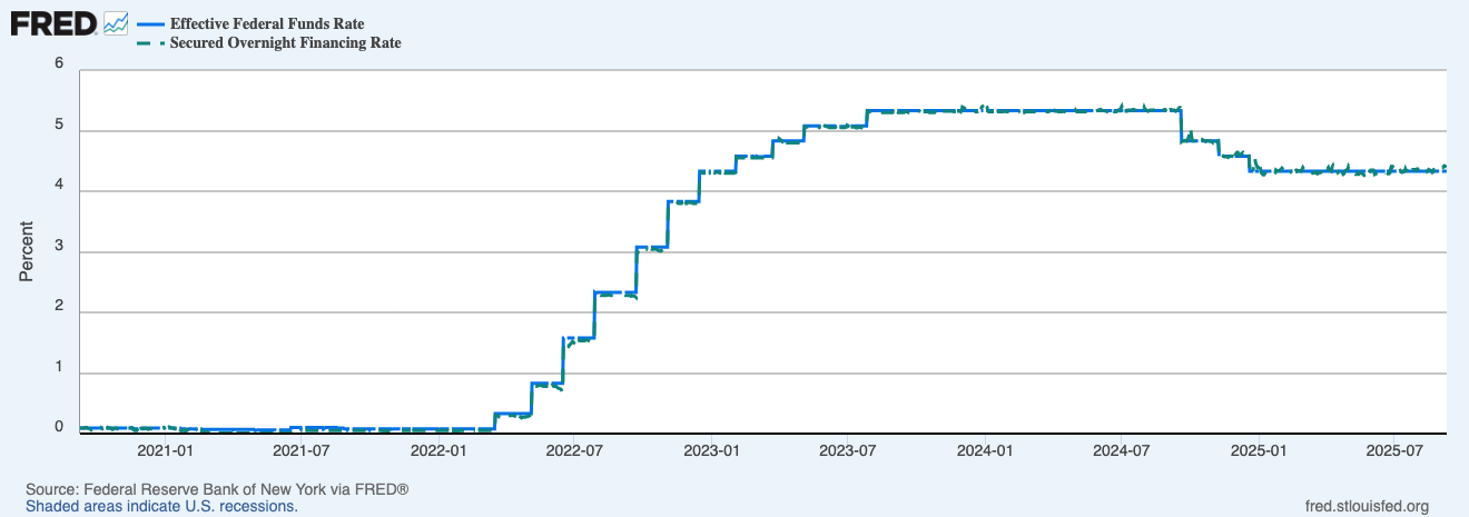
Effective Federal Funds Rate (EFFR) and SOFR are two front-end rates that show how US dollar funding is priced right now. EFFR reflects overnight unsecured lending of reserves between banks. SOFR reflects overnight secured funding in the Treasury repo market, collateralised by US Treasuries. When policy shifts, these move first, and the rest of the curve and risk assets tend to follow.
Key points
- EFFR is the policy anchor for overnight unsecured funding in bank reserves.
- SOFR is the main reference rate for secured overnight funding in the Treasury repo market.
- Both sit at the very front of the curve, so they react quickly to Fed hikes, pauses, and cuts.
- The gap between them is usually small, but repo plumbing and collateral dynamics can create brief moves.
If you want quick definitions for repo, real yields, DXY, and basis, see the Crypto Glossary.
What Are Fed Funds and SOFR?
- Effective Federal Funds Rate (EFFR) is the average rate banks charge each other for overnight unsecured reserves. It tracks the Fed’s policy stance.
- SOFR is the secured overnight funding rate in the Treasury repo market. It is collateralised by US Treasuries and has become the main reference rate for modern dollar funding.
Both sit at the front end of the curve. When policy shifts, these rates tend to move first.

This panel shows the hiking cycle, the plateau, then the early cutting phase… SOFR hugs EFFR with tiny gaps due to repo plumbing and collateral dynamics.
Why Policy Hits Liquidity Through These Two
- Bank reserves and repo cash reprice around EFFR and SOFR, so money-market funds and dealers change behaviour fast.
- Risk-free anchor rises or falls, changing hurdle rates for credit, equities, and crypto leverage.
- Collateral demand in repo tightens or loosens, affecting basis trades and funding available to market-makers.
What The Chart Is Telling You
- The step moves show policy lifts… each step tightened front-end funding and drained risk appetite.
- The plateau reflects a hold period… funding stable, liquidity more about issuance and cash balances.
- The drift lower signals easing… front-end relief can feed a softer dollar and friendlier tape for duration assets like tech and, often, crypto.
How It Transmits Into Markets
- Dollar and real yields: higher EFFR and firm SOFR keep the dollar bid and real yields high… risk assets feel it.
- Basis and funding in crypto: higher front-end rates raise the cost of carry. Positive funding has to beat cash yields or it gets faded.
- Liquidity pipes: shifts in RRP usage, bank reserves, and the TGA balance can amplify or mute the policy move. EFFR and SOFR are your first tell, the plumbing confirms it.
Watch-outs

- Month-end and quarter-end: repo can wobble as dealers manage balance sheets… SOFR may blip.
- Treasury bill supply: heavy bill issuance can pull cash from RRP, easing conditions even with steady EFFR.
- Bank stress days: spreads to SOFR can jump in specific markets while the headline rate looks calm.
- Single-day spikes: don’t overreact… look for persistence over several sessions.
A Simple Workflow You Can Reuse
- Open the EFFR + SOFR chart. Are we hiking, pausing, or easing.
- Check RRP, bank reserves, and TGA to gauge the liquidity impulse.
- Cross-check DXY and 10-year real yields to see if front-end shifts are reaching the tape.
- For crypto positioning… compare perp funding and basis to cash yields. If carry doesn’t clear the front-end hurdle, size down.
- Into big prints, trim leverage… react after the front-end settles.
Mini FAQs
Why does SOFR stick so close to EFFR.
Repo is the cash parking lot for Treasuries… the Fed’s corridor and abundant collateral keep SOFR near the policy stance.
Which one should traders watch day-to-day.
SOFR for plumbing quirks and collateral pressure, EFFR for the policy anchor… keep both on screen.
Can easing help risk even if growth is messy.
Yes, if front-end relief pulls the dollar and real yields lower, conditions can improve for beta while growth data chops around.
If this helped you translate policy into liquidity, join Alpha Insider for Macro Heat dashboards, calendar previews for the next prints, and a weekly positioning watchlist. Fewer mistakes, cleaner execution, more conviction.
The Markets Unplugged members get:
➡️ Kairos timing windows to plan entries before the crowd moves
➡️ A full DCA Targets page with levels mapped for this cycle
➡️ Exclusive member videos breaking down charts in plain English
➡️ A private Telegram community where conviction is shared daily
➡️ A dedicated Macro Analysis page with regularly updated analysis and monthly reports
Sorted… now execute.


Discussion