


A Fed pause means the Federal Reserve holds its target range steady. A Fed cut lowers that target range. Effective Federal Funds Rate (EFFR) trades inside the Fed’s corridor, so when policy changes, EFFR steps with it. Markets usually price the path ahead of the meeting, which is why the clean job is to read the expected path and the follow-through, not just the headline.
Key points
- Pause means the target range stays the same, and EFFR tends to stay flat inside the corridor.
- Cut means the corridor shifts lower, EFFR steps down, and front-end funding gets cheaper.
- The curve shape matters. Cuts can be relief or worry, depending on credit and growth expectations.
- Pair policy expectations with DXY and real yields to judge whether conditions are easing for risk assets.
If you want quick definitions for EFFR, SOFR, repo, DXY, real yields, and the 2s10s curve, see the Crypto Glossary.
EFFR With Target Range Bands
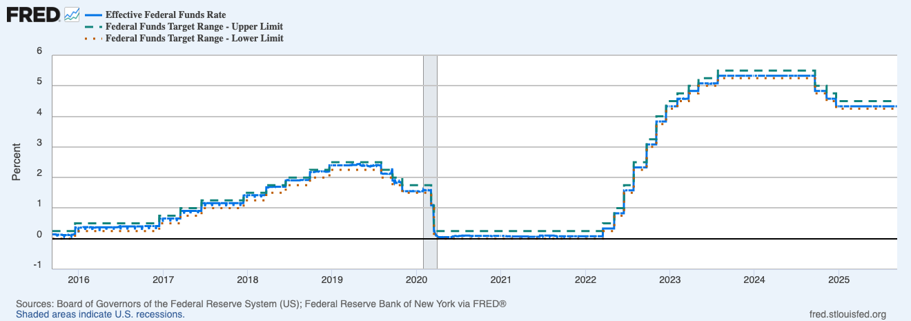
This panel shows step moves up in 2022-23, a long plateau, then early easing in 2024–25… EFFR hugs the corridor as policy changes.
How policy turns into pricing
- Corridor to EFFR: the Fed sets the upper and lower bounds… EFFR trades inside.
- EFFR to money markets: bills, repo, and short credit reprice around it.
- Front end to the rest of the curve: expectations leak into 2s, then 10s… the curve shape tells you if cuts are seen as growth-friendly or worry-driven.
- Into risk assets: cheaper funding and a softer dollar often help duration plays like tech and, often, crypto.
Reading “cuts vs pauses” without guessing
Pauses
- EFFR flat inside a steady corridor… outcomes depend on liquidity plumbing.
- If RRP drains and bank reserves rise, conditions can still improve even with a pause.
Cuts
- Corridor shifts lower… EFFR steps down.
- Bull steepener vibes when 2s drop faster than 10s… easier backdrop for beta.
Noisy weeks
- Futures can swing on CPI, payrolls, or speeches… wait for persistence across a few sessions before changing stance.
What the attached chart is saying right now
- You can see the staircase up in 2022. Each step tightened front-end funding and reduced risk tolerance.
- The flat shelf shows the pause phase. Moves in risk assets often depended more on liquidity and issuance than policy itself.
- The drift lower in EFFR marks the start of easing. Front-end relief that often feeds through to a softer dollar and friendlier conditions.
Watch-outs
- Month-end/quarter-end… repo quirks can nudge SOFR while EFFR looks calm.
- Treasury bill supply… heavy issuance can tighten conditions even during a pause.
- One hot print… don’t flip your view on a single CPI day… look for the trend.
- Cuts for the wrong reason… if credit widens and equities sag while cuts are priced, that’s risk aversion not relief.
A simple workflow you can reuse
- Keep EFFR vs the corridor on screen… hiking, pausing, or easing.
- Check FedWatch for the path over the next 2–3 meetings… is the market leaning one way.
- Cross-check 2s10s… bull steepener suggests relief, bear steepener says growth or supply is pushing long yields up.
- Add DXY and 10-year real yields… if both slip with cuts priced, beta breathes.
- Map crypto specifics… does perp funding or basis clear cash yields… if not, size down.
Mini FAQs

Is a pause bullish or bearish.
Neither by itself… the plumbing and data decide. Pauses with reserve growth can still be friendly.
Do cuts always lift risk.
Not if they arrive into a credit wobble. Watch HY spreads and the curve shape.
Why use EFFR instead of the dot plot.
EFFR reflects what’s happening… dots are guidance. Price action listens to the corridor and the front end.
If this helped you read the policy path without noise, join Alpha Insider for Macro Heat dashboards, calendar previews for the next prints, and a weekly positioning watchlist. Fewer mistakes, cleaner execution, more conviction.
The Markets Unplugged members get:
➡️ Kairos timing windows to plan entries before the crowd moves
➡️ A full DCA Targets page with levels mapped for this cycle
➡️ Exclusive member videos breaking down charts in plain English
➡️ A private Telegram community where conviction is shared daily
➡️ A dedicated Macro Analysis page with regularly updated analysis and monthly reports
Sorted… now execute.


Discussion