


Key Points
- URPD stands for UTXO Realised Price Distribution… it shows how much Bitcoin supply last moved at each price level.
- It is best read as a cost basis histogram, where taller bars mark price zones with heavy realised volume.
- Those high-volume zones often act like reaction areas when revisited, because large groups of holders share similar cost basis there.
- URPD is not a time series indicator… it maps where cost basis sits by price, not how it evolves day to day.
- Use URPD to identify thick zones and thin zones… thick zones tend to absorb better, thin zones can move faster once price enters them.
- URPD works best with confirmation, pair it with realised price bands, SOPR or realised profit and loss, and spending-age tools like CDD or dormancy.
- This guide is part of the Bitcoin on-chain series. For the full library of indicators and explainers, see the Bitcoin on-chain indicators hub.
- If any terms feel unfamiliar, use the Crypto Glossary, then return here.
Quick Answer
URPD shows where Bitcoin’s cost basis is concentrated by price level, using the last-moved price of each UTXO. High bars highlight zones where a lot of supply changed hands, which can help explain why price reacts when it returns to those levels. Use URPD to map key cost basis clusters first, then confirm the quality of any revisit using behaviour metrics like SOPR and realised profit and loss to see whether the level is being absorbed or distributed.
What Is URPD?
URPD stands for UTXO Realised Price Distribution. It shows how much of the supply last moved at each price level. Think of it as a histogram of cost basis. Tall bars mark price zones where significant capital changed hands, which often act as support or resistance when revisited.
How Is URPD Built?
- Each UTXO has a last-moved price.
- Group UTXOs into price bins.
- Sum the coin amount per bin to show how much supply realised its cost basis there.
- The result is a distribution across price levels rather than a time series.
URPD does not predict price. It maps where cost basis clusters exist so you can prepare for how the market may behave when those levels return.
Why URPD Matters
- Reveals pinned capital. Levels with large realised volume tend to attract reaction.
- Distinguishes newly formed bases from thin zones.
- Complements behaviour tools by showing where absorption is likely.
Reading the Attached Chart
The image below is a UTXO Age-Band Realised Price panel from Coinglass. It is a time series companion to URPD. Each line tracks the realised price for a specific age cohort. Together they show how cost basis migrates through time and which cohorts are driving resets.
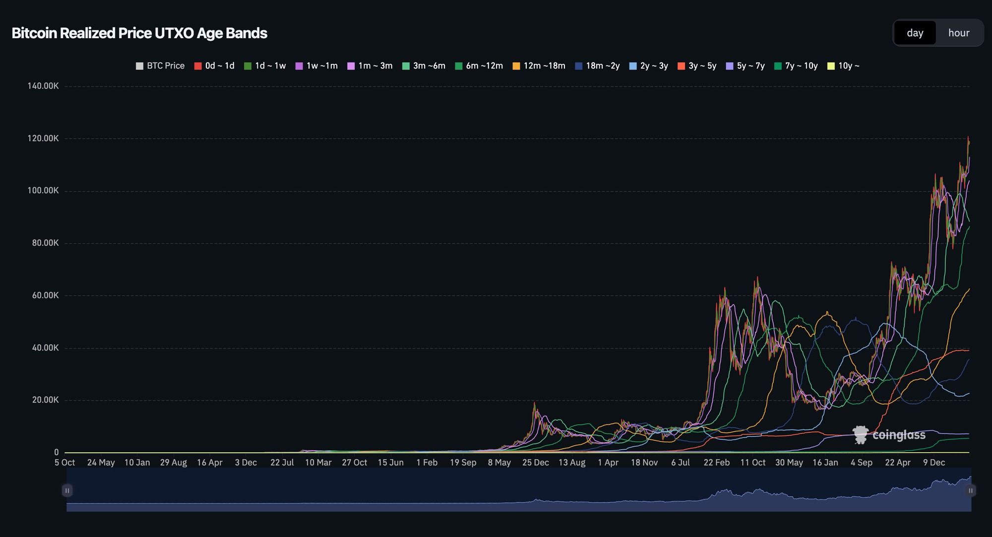
This chart plots realised price for each age cohort so you can see cost-basis migration, crossovers, and where pressure sits after rallies or pullbacks.
What this panel shows and how to read it
- Younger bands rising quickly signal that recent buyers have reset their cost basis higher. After strong advances this often expands the 1m–3m and 3m–6m lines.
- STH stress vs relief appears when price dips back toward the 1–3m or 3–6m realised price lines. If price holds above them, pullbacks are being absorbed.
- Older bands moving such as 2–3y, 3–5y, 5–7y indicate meaningful activity from seasoned supply. When these rise together it often reflects redistribution from older holders into newer hands.
- Crossovers between mid-age bands highlight rotation. For example, a 6–12m line crossing up through 3–6m suggests last year’s buyers have repriced higher.
- Flat very old bands like 7–10y or 10y imply dormancy. That usually supports trend strength because the deepest holders are not providing extra supply.
Use this panel to infer which cohorts will be most sensitive if price revisits their realised price. Then cross-check with a URPD histogram to confirm how much supply actually sits at those levels.
Practical Use With Confluence
- URPD histogram for level sizing: where the biggest pockets of cost basis sit.
- Realised Price bands for the ladder: Market, LTH, STH.
- SOPR and Realised PnL for behaviour at those levels: absorption or distribution.
- Dormancy or CDD to validate whether older coins are driving changes in the age-band lines.
Common Pitfalls

- Mixing the two views. URPD is distribution by price, the attached panel is age-band realised price over time. Use both, but read them for what they are.
- Treating levels as guarantees. Large clusters improve the chance of reaction, not certainty.
- Ignoring cohort context. A revisit to a level dominated by short-term holders trades differently to one dominated by multi-year holders.
A Simple Workflow You Can Reuse
- Open a URPD histogram to mark the largest cost-basis clusters.
- Open the UTXO age-band realised price panel and note which cohorts would be affected if those levels are revisited.
- Check aSOPR and Realised PnL around those revisits for absorption or distribution.
- Cross-check Market, LTH, STH Realised Price for the ladder context.
- Decide: strong base with supportive cohorts, or thin pocket with risk of slippage.
Mini FAQs
What does URPD show in simple terms?
It shows how much Bitcoin supply last moved at each price, so you can see where cost basis is clustered.
Is URPD the same as realised price bands?
No. Realised price bands are time series levels like Market, STH, and LTH realised price. URPD is a distribution by price that shows where supply is concentrated.
Why do large URPD clusters matter?
Big clusters mean many holders share similar cost basis in that zone, so revisits can trigger stronger reactions as positions go from loss to breakeven, or profit to profit-taking.
Does URPD predict support and resistance?
No. It improves context by highlighting where reaction is more likely, but behaviour indicators confirm whether a level is being absorbed or sold into.
How do you combine URPD with age-band realised price panels?
Use age bands to see which cohorts would be affected by a revisit, then use URPD to confirm how much supply actually sits at those levels.
What should be used for confirmation?
SOPR or realised profit and loss for behaviour at the level, realised price bands for ladder context, and CDD or dormancy to see whether older supply is driving the move.
How often should URPD be checked?
Weekly is usually enough for most readers. URPD changes more meaningfully when price travels far enough to create a new cluster.

If this helped you map cost basis clusters properly, Alpha Insider members can access deeper Bitcoin on-chain analysis and commentary here.
Alpha Insider members get:
➡️ Kairos timing windows to plan entries before the crowd moves
➡️ A full DCA Targets page with levels mapped for this cycle
➡️ Exclusive member videos breaking down charts in clear, simple terms
➡️ A private Telegram community where conviction is shared daily
Built for consistent on-chain reads, week to week.
Legal And Risk Notice
This content is for education only and does not constitute financial advice. Crypto assets are volatile and you can lose money. Always do your own research and consider your risk tolerance.


Discussion