


Key Points
- Address cohorts group Bitcoin holders by size so you can see which parts of the market are accumulating or distributing.
- Use cohort trends as context, not as standalone triggers, the signal is direction and persistence over weeks.
- Prefer balance based or entity adjusted views where possible, address counts can be distorted by wallet splitting.
- The clean read comes from combining cohort shifts with exchange netflows and realised profit acceptance.
This guide is part of the Bitcoin on-chain indicators hub. Browse the full hub here.
For quick definitions of key terms used in this guide, see the Crypto Glossary.
Quick Answer
Bitcoin address cohorts slice holders into size bands, from small wallets to whales, so you can see who is net accumulating and who is net distributing. When a cohort’s balance trends up for weeks, that group is accumulating, when it trends down for weeks, that group is distributing. The best signal is persistence, then confirmation, pair cohort shifts with exchange netflows and realised profit metrics to see whether supply is being absorbed or leaning on price.
What Are Bitcoin Address Cohorts?
Bitcoin address cohorts group wallets by balance size so you can track behaviour across the market, from smaller holders to large holders. The goal is simple, work out which groups are increasing their holdings and which groups are reducing them.
Treat cohorts as a behaviour dial. They are most useful for understanding demand quality and distribution risk over time.
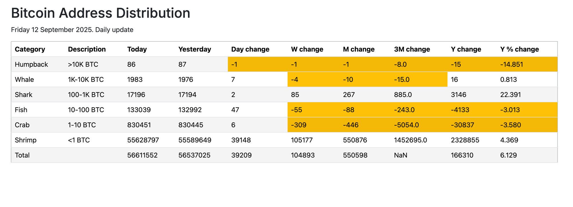
Common Cohort Bands
Different providers label bands slightly differently, so always check the chart legend.
- Plankton: under 0.1 BTC
- Shrimps: 0.1 to 1 BTC
- Crabs: 1 to 10 BTC
- Fish: 10 to 100 BTC
- Sharks: 100 to 1,000 BTC
- Whales: 1,000 to 10,000 BTC
- Humpbacks: over 10,000 BTC
How To Read Address Distribution Charts
Start with the simplest rule.
- If a cohort’s total balance trends up, that cohort is a net accumulator.
- If a cohort’s total balance trends down, that cohort is a net distributor.
Then apply the filter that stops most misreads.
- Best filter: persistence, look for multi-week direction, not one-day spikes.
- Second filter: step changes can be reclassification, custody moves, or exchange housekeeping, confirm before interpreting.
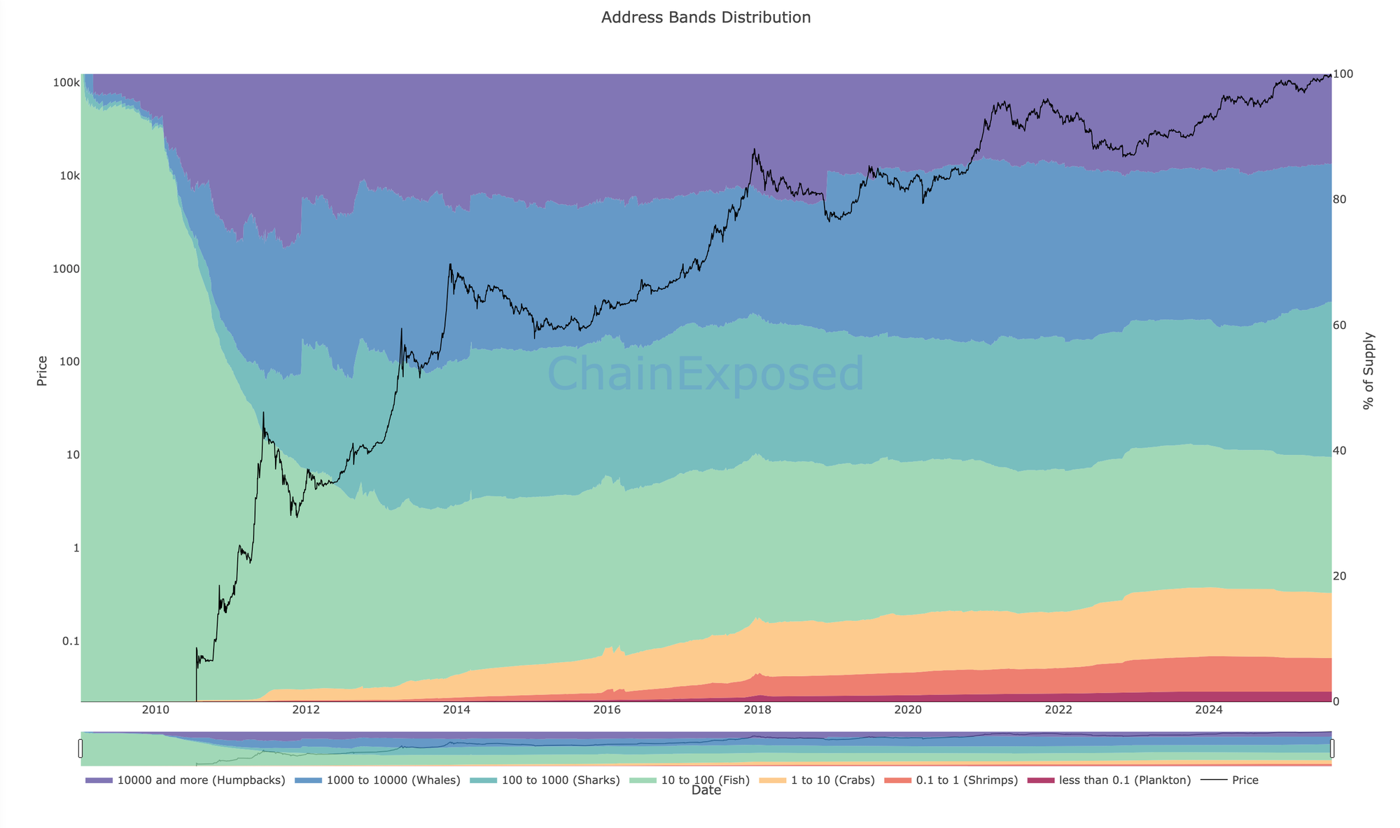
This stacked chart shows how supply share shifts between holder size bands over time. Focus on multi-week changes in supply share rather than small day-to-day moves.
Why Address Counts Can Mislead
Address counts can rise even if there is no meaningful accumulation, because:
- One holder can split funds across multiple addresses
- Exchanges and custodians can restructure wallets
- New wallet generation does not always equal new demand
If you are choosing between two charts, prioritise balance held by cohort over number of addresses.
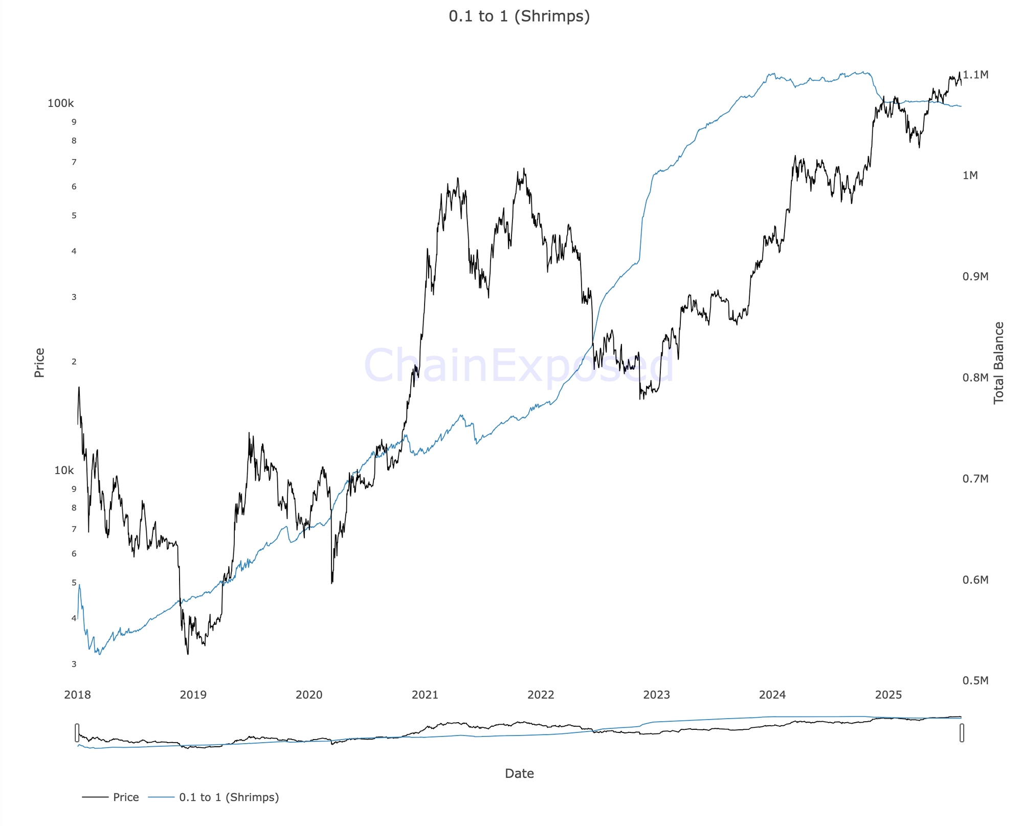
This view isolates smaller holders so you can see whether broad accumulation is steady or fading. The cleaner signal is a sustained upward drift, not a single spike.
What Cohort Behaviour Usually Means
Use these as behaviour reads, not guarantees.
Small Cohorts Rising
Often suggests broader grassroots accumulation, especially if it persists and aligns with exchange outflows.
Sharks Rising
Often reflects deliberate accumulation by larger holders who are active but not the biggest custodians.
Whales Rising Or Falling
Can be meaningful, but also heavily distorted by custody changes, ETF wrappers, and exchange re-tags. Confirmation matters more here than anywhere.
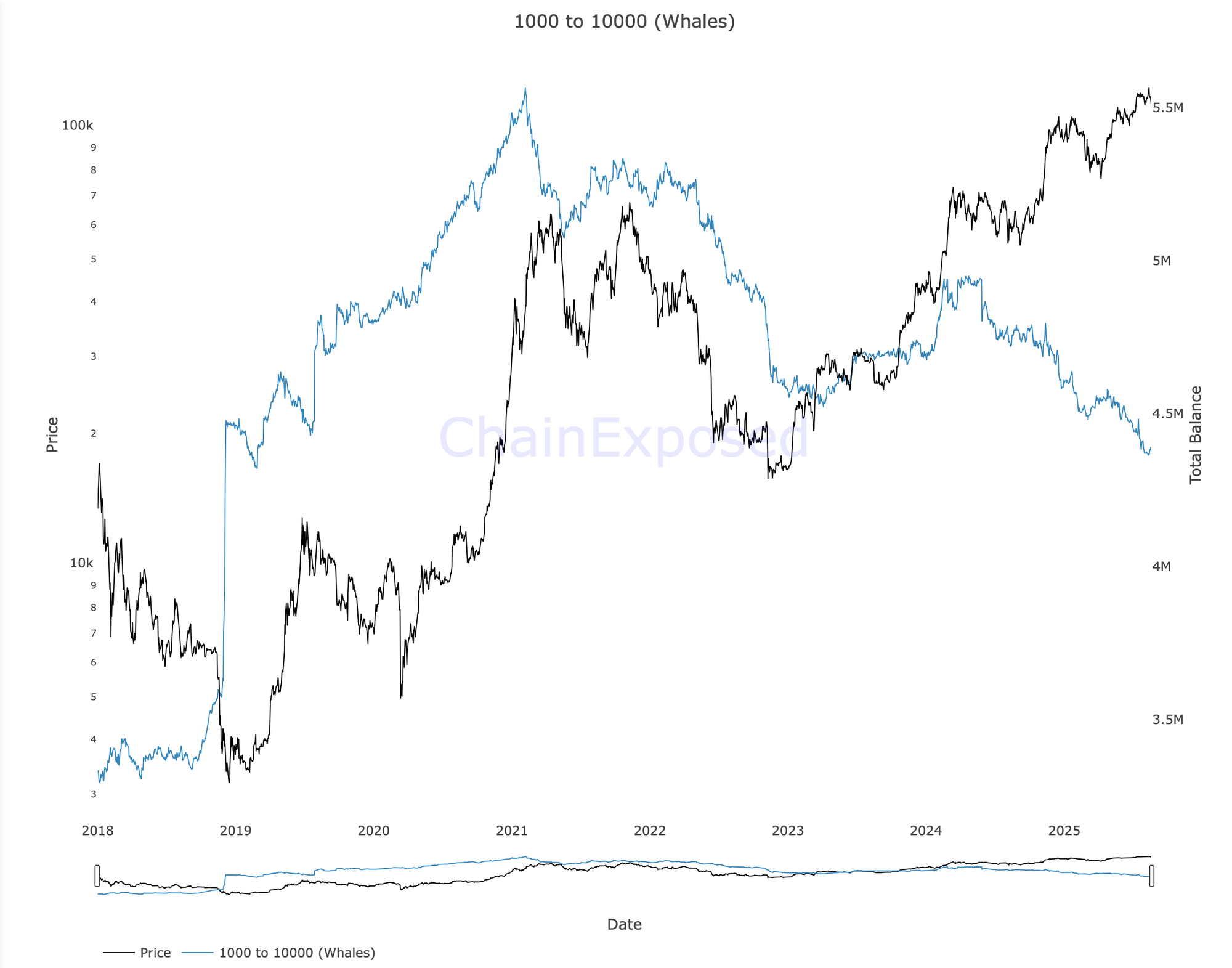
Large-holder shifts can reflect distribution, custody migration, or internal treasury moves. Treat step changes with caution and confirm with exchange netflows and acceptance metrics before drawing conclusions.
The Confirmation Layer That Makes Cohorts Useful
Cohorts alone tell you who is holding more or less BTC. They do not tell you whether coins are heading to venues, or whether selling is being absorbed.
Pair cohorts with two confirming categories.
Flows
- Exchange netflows or exchange reserves: confirms whether BTC is moving to or from venues
- Miner outflows: adds context for issuance pressure during the same period
Acceptance
- SOPR or Realised PnL Ratio: shows whether realised profit taking is being accepted
- Spending-age metrics (CDD, VDD, HODL waves): shows whether older supply is moving during distribution phases
This chart helps confirm whether cohort shifts are leaning on venue liquidity. Sustained outflows often support trend continuation, while sustained inflows can signal rising sell-side availability.
Practical Signals That Matter Most
Broad Accumulation Signal
Small cohorts rising and sharks rising together for weeks, with exchange outflows and stable acceptance.
Concentrated Accumulation Signal
Sharks and whales rising while small cohorts are flat, this can still be bullish, but it needs stronger flow confirmation.
Distribution Risk Signal
Whales and sharks falling together with exchange inflows and profit metrics heating, distribution becomes harder to ignore.
Common Traps To Avoid
- Treating whales as automatically smart money, whales can distribute for custody, treasury, or risk reasons.
- Overreacting to one week, cohort data is best as a slow dial.
- Ignoring flows, cohort accumulation with heavy inflows to exchanges can still mean sell pressure is building.
- Forgetting supply growth, compare cohort changes to circulating supply growth where possible.
A Weekly Workflow You Can Reuse
- Step 1: Check the stacked cohort chart and note which bands are gaining or losing share.
- Step 2: Log the 4-week change for one small cohort group and one large cohort group.
- Step 3: Cross-check exchange netflows or reserves, are coins leaving venues or moving in.
- Step 4: Check acceptance, SOPR or Realised PnL Ratio, is profit taking being absorbed.
- Step 5: Act only on multi-week alignment, persistence beats headlines.
Mini FAQs
Are Whales Always The Smart Money?
No. Whale moves can be custody changes, treasury management, or distribution. Use flows and acceptance metrics to confirm the read.
Can Address Counts Be Distorted By Wallet Splitting?
Yes. One entity can spread funds across many addresses. Balance-based or entity-adjusted views are usually more reliable.
Do Cohort Bands Work For Altcoins Too?
Sometimes, but tagging quality and coverage are often weaker. Bitcoin cohort data is generally cleaner.
What Is The Most Useful Cohort Signal?
Multi-week accumulation across multiple cohorts, confirmed by exchange outflows and steady profit acceptance.
If this helped you see who’s actually buying Bitcoin without guesswork, join Alpha Insider for weekly timing windows, dashboards, and member videos. Fewer mistakes… cleaner execution… more conviction.
Alpha Insider members get:
➡️ Kairos timing windows to plan entries before the crowd moves
➡️ A full DCA Targets page with levels mapped for this cycle
➡️ Exclusive member videos breaking down charts in plain English
This isn’t noise… it’s the full playbook.
Legal & Risk Notice
This guide is for education only… not financial, investment, legal, accounting, or tax advice. Nothing here is a recommendation to buy, sell, or use any product or service. Cryptoassets are high risk… prices can go to zero… only use amounts you can afford to lose. Availability and legality vary by country… check your local rules before acting. You are responsible for your own decisions.


Discussion