


Single-candle patterns are simple chart formations that can hint at rejection, hesitation, or changing momentum inside Bitcoin and crypto price action. The most useful beginner patterns are the hammer, hanging man, shooting star, inverted hammer, doji, and spinning top. Each one can suggest something about buyer or seller behaviour, but none of them is a magic signal. The real value comes from reading the candle in context, not from treating one shape as a guaranteed outcome.
What Single-Candle Patterns Can Tell You
Single-candle patterns matter because one candle can sometimes reveal more than it first seems. A long wick, a small real body, or a near-flat open and close can all tell you something about how buyers and sellers behaved during that period.
That does not mean one candle decides the market. It means one candle can give you a useful clue. For beginners, the best approach is to treat candle patterns as part of a wider chart read rather than as a standalone answer. For quick definitions of related terms, use the Crypto Dictionary.
Why Context Matters More Than The Candle Alone
A hammer in the middle of noisy sideways movement is not the same as a hammer after a hard sell-off into a major support area. A doji after a strong directional move is not the same as a doji inside random chop. The shape matters, but the location matters more.
That is why candlestick patterns should always be read with context. Trend, nearby support and resistance, candle size, volume, and the broader structure around the level all matter. A pattern can suggest something important, but it still needs the chart around it to give that suggestion meaning.
Hammer
What It Is
A hammer is a single-candle pattern that usually appears after a decline or corrective phase. It has a small real body near the top of the candle and a longer lower wick beneath it.
What It Can Suggest
A hammer can suggest that sellers pushed price lower during the period but failed to hold that weakness into the close. Buyers stepped in strongly enough to pull price back upward before the candle finished.
Key Characteristics
| Location | Usually appears after a decline or clear pullback. |
| Body | Small real body near the top of the candle range. |
| Wick | Long lower wick, often much larger than the body. |
| Context | More useful near support or after visible weakness. |
Why Context Matters
A hammer is not automatically bullish just because the shape looks right. It becomes more meaningful if it appears after visible weakness, near a level that already matters on the chart, or where the wider structure suggests selling pressure may be fading.
Bitcoin Chart Example
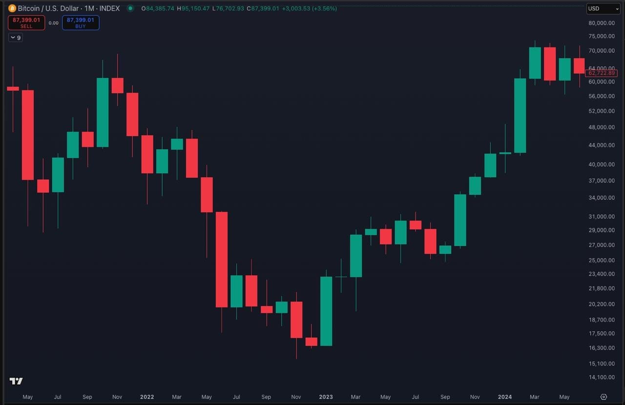
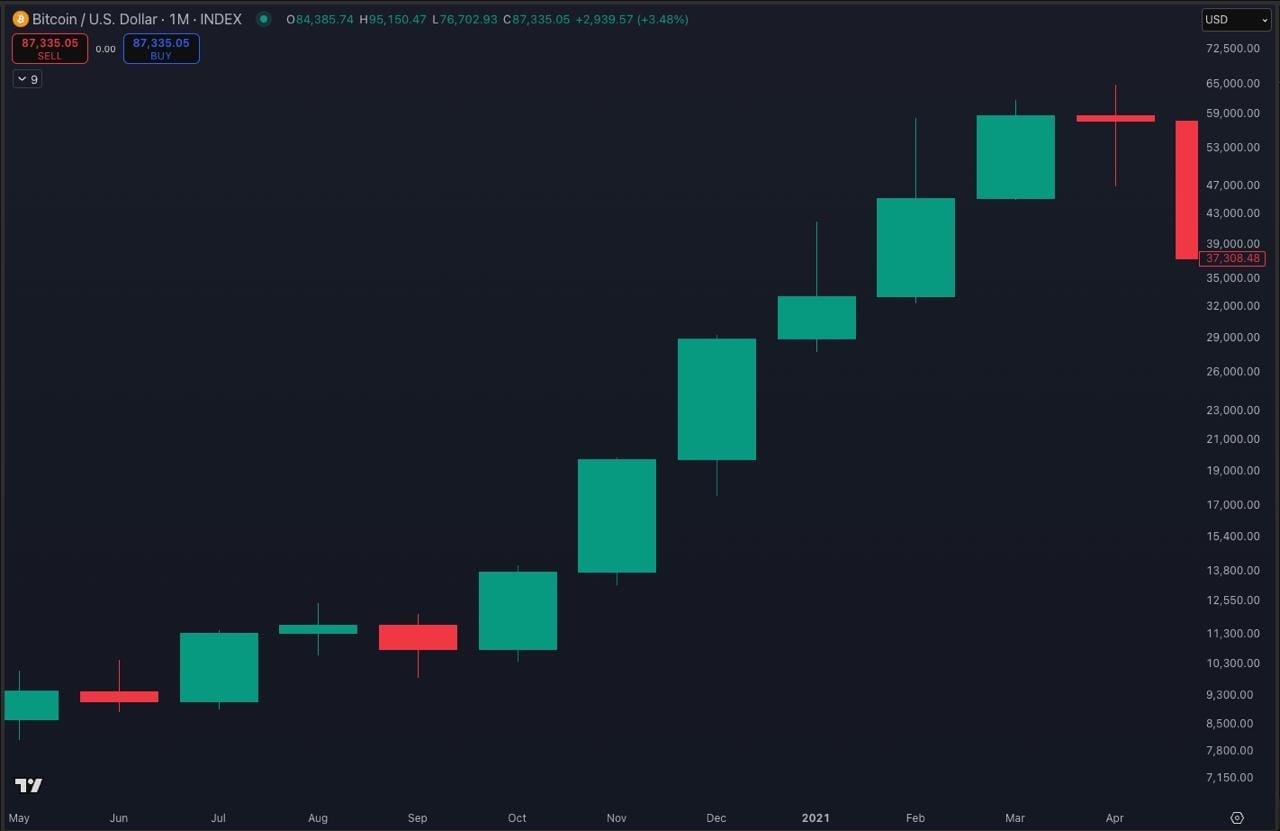
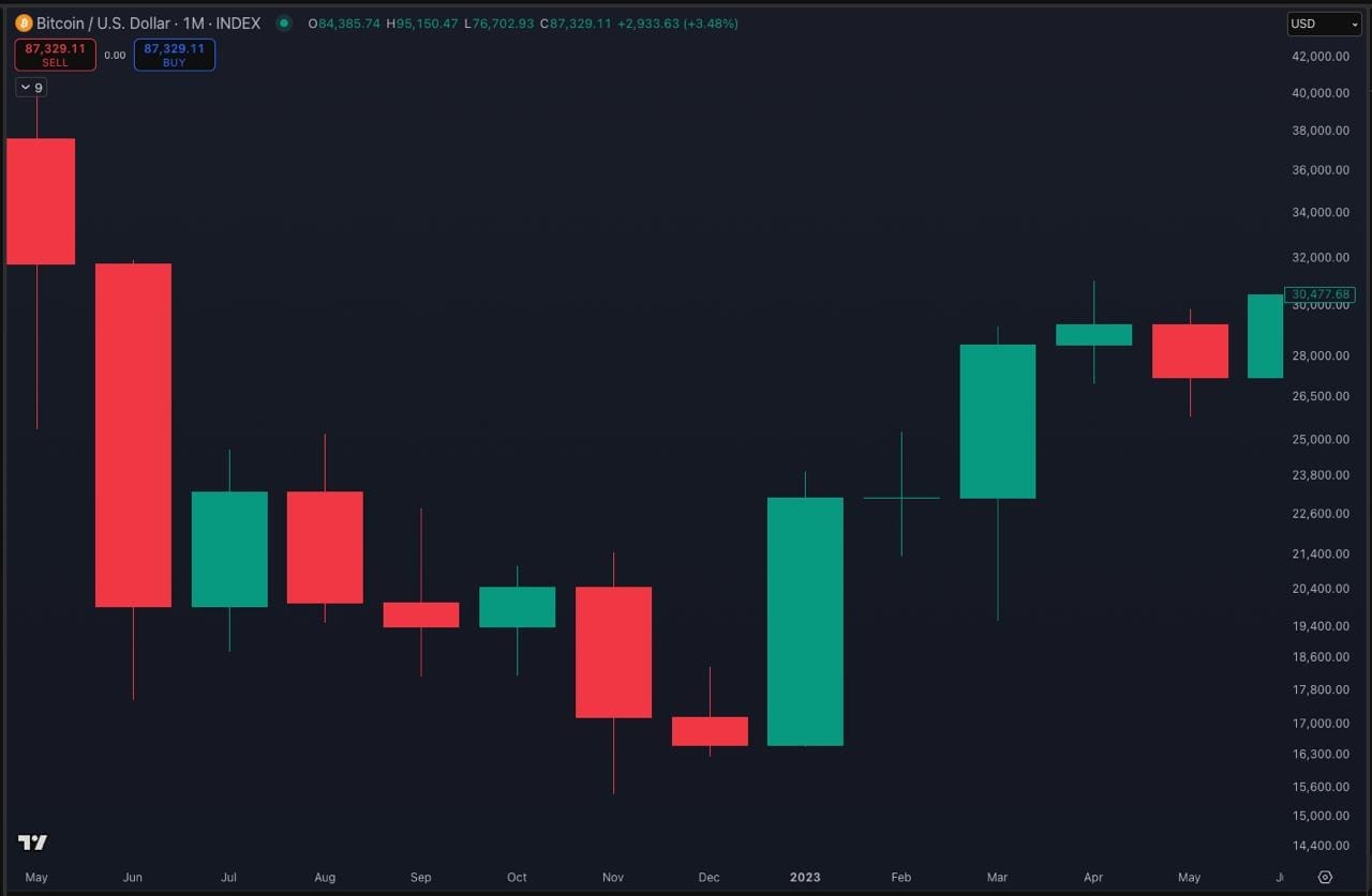
The supplied Bitcoin monthly chart shows a hammer-style example around the late-2022 bear-market low area. The main lesson is not that one candle called the bottom. The lesson is that the candle showed sharp rejection of lower prices after heavy weakness, which made it worth taking seriously inside the wider chart context.
Hanging Man
What It Is
A hanging man is a single-candle pattern that appears after an uptrend. It looks very similar to a hammer, with a small real body near the top and a long lower wick.
What It Can Suggest
A hanging man can suggest that price dipped sharply during the period even though it recovered before the close. That can be an early sign that bullish control is becoming less secure.
Key Characteristics
| Location | Appears after a sustained upward move. |
| Body | Small real body near the top of the candle. |
| Wick | Long lower wick, with little or no upper wick. |
| Context | More useful near resistance or into a stretched advance. |
Why Context Matters
The shape alone is not enough. A hanging man matters more when it forms after a strong advance, near a key resistance area, or into a stretched part of the trend. Without that context, it may only be a noisy pause rather than a meaningful warning.
Bitcoin Chart Example
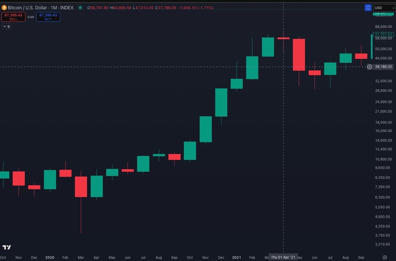
The supplied monthly Bitcoin chart shows a hanging man example around April 2021, near the first major peak of that cycle. The candle is useful because it appears after a strong rise and shows deeper intraperiod weakness than the closing body suggests.
Shooting Star
What It Is
A shooting star is a bearish-style single-candle pattern that appears after an uptrend. It has a small real body near the lower part of the range and a long upper wick.
What It Can Suggest
A shooting star can suggest that buyers pushed price higher during the period but could not hold those gains. Price was rejected from the upper area before the candle closed.
Key Characteristics
| Location | Appears after a strong upward move. |
| Body | Small real body near the lower end of the range. |
| Wick | Long upper wick, usually much larger than the body. |
| Context | More useful near visible resistance or after strong expansion. |
Why Context Matters
A shooting star matters more if it appears at a stretched point in the move, near visible resistance, or after strong bullish expansion. In weak context, it may only reflect temporary hesitation rather than a genuine shift.
Bitcoin Chart Example
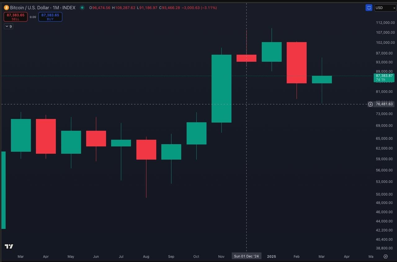
The supplied monthly Bitcoin chart shows a shooting star example in December 2024. The important educational point is that the candle shows failed upside follow-through and visible rejection near the highs, not that it guarantees the next move.
Inverted Hammer
What It Is
An inverted hammer is a single-candle pattern that usually appears after a decline. It has a small real body near the lower part of the range and a long upper wick.
What It Can Suggest
An inverted hammer can suggest that buyers managed to push price upward during the period, even if they did not finish with full control. That can be an early sign that the downside move is losing some strength.
Key Characteristics
| Location | Usually appears after a decline or softer corrective phase. |
| Body | Small real body near the lower end of the candle. |
| Wick | Long upper wick, with little or no lower wick. |
| Context | More useful near support or after visible weakness. |
Why Context Matters
An inverted hammer should not be treated as a bottoming guarantee. It becomes more useful if it appears after clear weakness, near a meaningful support zone, or where the broader structure suggests sellers may be tiring.
Bitcoin Chart Example
The supplied monthly Bitcoin chart includes a September 2020 inverted-hammer-style example. It is best read as an illustrative context example rather than as a perfect one-candle decision point. The pattern matters because it shows an early upside probe after weaker price action, not because it guarantees reversal.
Doji
What It Is
A doji forms when the opening and closing prices are very close to each other, creating a very small real body. It often has upper and lower wicks, although the exact shape can vary.
What It Can Suggest
A doji usually suggests indecision. Neither buyers nor sellers clearly took control by the close, even if price moved around during the period.
Key Characteristics
| Body | Very small or near-flat real body. |
| Wicks | Often has upper and lower wicks. |
| Location | Can appear after trends, in consolidations, or during transitions. |
| Context | More meaningful when it interrupts strong prior momentum. |
Why Context Matters
A doji does not tell you which direction comes next. It only tells you that the market paused or hesitated. That can matter more after a strong move than inside ordinary sideways action.
Bitcoin Chart Example
The supplied monthly Bitcoin chart shows a doji-style example around February 2023. The useful lesson is that the candle reflects hesitation after a strong rebound phase. It does not settle the next direction by itself.
Spinning Top
What It Is
A spinning top is a single-candle pattern with a small real body and visible upper and lower wicks. It often looks balanced, with neither side keeping strong control into the close.
What It Can Suggest
A spinning top usually suggests hesitation or a temporary balance between buyers and sellers. It can show that momentum slowed or that the market paused after a move, but it does not predict direction on its own.
Key Characteristics
| Body | Small real body. |
| Wicks | Visible upper wick and lower wick. |
| Location | Often appears after a directional move or near an important level. |
| Context | Usually reflects balance, hesitation, or reduced conviction. |
Why Context Matters
A spinning top matters more after a strong move, near support or resistance, or when the chart already looks stretched. In weak context, it may simply be ordinary pause behaviour rather than an important signal.
Bitcoin Chart Example
The supplied Bitcoin monthly chart shows a March 2025 spinning top example. The educational point is that the small body and visible wicks show a pause in control, which becomes more meaningful if it appears near an important area or after a stronger move.
How To Read Single-Candle Patterns With Context
The cleanest way to use candle patterns is to read them with the rest of the chart.
Start with the broader trend. Then check whether the candle appears near a support or resistance area that already matters. After that, look at the candle’s size relative to the surrounding candles, the strength of the wick rejection, and whether volume or broader structure supports the read. If you already understand concepts like fair value gaps, strong and poor highs and lows, or auction-style structure, those can help refine the read further.
That does not mean you need ten indicators. It means one candle should fit the wider chart story before you give it real weight.
Common Single-Candle Pattern Misreads
One common mistake is treating a candle pattern as a direct instruction. A hammer is not buy now. A shooting star is not sell now. A doji is not a forecast. A spinning top is not a directional call.
Another mistake is ignoring where the candle appears. The same shape can mean much less if it forms in random chop rather than at a meaningful edge. Beginners also often overrate textbook appearance and underrate context. A decent pattern in strong context is usually more useful than a perfect-looking pattern in weak context.
The healthier mindset is simple: the candle can suggest, but it cannot guarantee.
Why These Patterns Matter For Bitcoin And Wider Crypto Charts
Bitcoin is a useful teaching chart because its higher-timeframe candles often show these patterns clearly. That makes the learning easier. But the same ideas can also help when reading Ethereum and altcoin charts, provided you stay aware that thinner or more volatile markets can produce noisier candle behaviour.
These candle concepts also come up inside our members’ video updates, where chart context is discussed in real time. The public lesson, though, stays the same. The candle shape matters, but the context around it matters more.
Source Note
This article is an educational TA explainer based on TMU’s own Bitcoin chart examples. Chart visuals use TradingView charts with TMU annotation and are credited directly below each image.
Mini FAQs
Legal And Risk Notice
This article is for educational purposes only and should not be treated as financial, investment, legal, tax or accounting advice. Candlestick patterns can help organise chart reading, but they do not guarantee reversals, continuation, entries, exits or profitable outcomes. Crypto markets are highly volatile, and a candle pattern can fail even when it looks clear. Always treat these patterns as context, not as proof of what must happen next.


Discussion