


In crypto technical analysis, poor highs and poor lows usually suggest an auction that looks unfinished, while strong highs and strong lows usually suggest cleaner rejection at the edge of the move. These ideas come from auction and Market Profile thinking, where traders look at whether price ended a move neatly or left behind signs of imbalance. They can be useful for reading Bitcoin, Ethereum and altcoin structure, but they are not guarantees. A level can still be revisited, respected, broken, swept, ignored or invalidated.
What Strong And Poor Highs And Lows Mean In Crypto
Strong and poor highs and lows are chart-reading ideas used to judge how cleanly price finished an auction at the top or bottom of a move. In simple terms, they help you ask whether the market ended a push in a convincing way or whether the edge of the move still looks unfinished.
That matters because not every high and low carries the same quality. Some look clean and decisive. Others look weak, flat, crowded or unfinished. Learning the difference can help beginners read chart structure more clearly.
Why These Levels Matter In Market Structure
These levels matter because they give extra information about how the market arrived at an important edge. A chart does not only show where price stopped, it also shows how that stop happened.
A poor high or poor low may suggest the auction at that edge did not finish cleanly. A strong high or strong low may suggest cleaner rejection, stronger excess or a more decisive ending to that part of the move. None of that creates certainty, but it does improve context.
How Auction Structure And Market Profile Connect To These Levels
These ideas are closely linked to auction-market thinking and Market Profile language. In that framework, markets move higher and lower as they search for prices that attract or reject participation.
A cleanly finished auction often shows clearer rejection at the edge. An unfinished auction often looks flatter, more crowded or less complete. That is why poor highs and poor lows are often described as unfinished, while strong highs and strong lows are often described as cleaner auction endings.
You do not need full Market Profile expertise to use these ideas. The beginner version is simpler. Ask whether the top or bottom of the move looks complete or unfinished.
What A Poor High Is
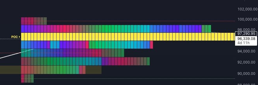
A poor high is a high that looks unfinished near the top of the auction. It often appears flatter, less decisive or too neatly capped, rather than showing clear rejection at the edge.
In practical chart-reading terms, a poor high can suggest the auction reached upward but did not finish with obvious excess. That does not mean price must come back. It means the high may carry a weaker structural quality than a cleaner, stronger high.
Why A Poor High Can Look Unfinished
A poor high can look unfinished because the market reached an upper level without showing a cleaner rejection at the edge. Instead of stretching and rejecting more decisively, the auction can look cut off, crowded or mechanically flat.
That is why beginners often hear that poor highs can leave the chart feeling unfinished. The important correction is this: unfinished does not mean guaranteed revisit. It only means the structure may look less complete than a stronger high.
What A Poor Low Is
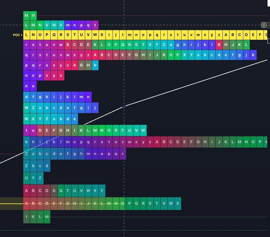
A poor low is a low that looks unfinished near the bottom of the auction. Like a poor high, it often appears flatter, less decisive or too neatly capped at the edge of the move.
In simple terms, the market pushed lower but did not show the cleaner rejection you might expect from a stronger low. That can make the low worth noting as weaker structure, but not as a promise that price must return there.
Why A Poor Low Can Look Unfinished
A poor low can look unfinished because the lower edge of the auction did not resolve in a cleaner way. Instead of showing a clearer stretch, rejection or excess, price can stop in a way that feels abrupt or incomplete.
That is why poor lows are often watched more carefully than ordinary lows. They can suggest the bottom of the move was not fully resolved. But again, that is context, not certainty.
What A Strong High Is
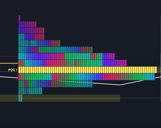
A strong high is a high that shows a cleaner rejection from the upper structure. In auction terms, it often looks more complete and can suggest stronger excess at the edge of the move.
That makes it different from a poor high. A strong high tends to show a more convincing finish to the upside auction, rather than a flat or unfinished stop.
Why A Strong High Can Show Cleaner Rejection
A strong high can show cleaner rejection because the market pushed to an upper area, found less willingness to continue there, and rejected more decisively. That cleaner rejection often gives the high more structural quality.
Beginners should still avoid overclaiming what that means. A strong high is not guaranteed to hold forever, and it is not a promise of reversal. It simply looks cleaner than a poor high.
What A Strong Low Is
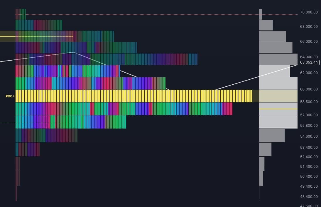
A strong low is a low that shows a cleaner rejection from the lower structure. In practical chart terms, it often looks more complete than a poor low and can suggest stronger excess at the bottom edge of the move.
That is why strong lows are often easier to read. The auction at the bottom looks less unfinished and more decisively rejected.
Why A Strong Low Can Show Cleaner Rejection
A strong low can show cleaner rejection because price pushed down, failed to attract enough follow-through at the edge, and rejected that lower area more clearly. That usually makes the low look more resolved than a poor low.
But a strong low is still not a guarantee. It can later be revisited, respected, broken, swept, ignored or invalidated depending on wider chart conditions.
What Excess Means In Straightforward Language
Excess is a simple idea that often sounds more complicated than it needs to. In straightforward terms, excess means price pushed beyond the area enough to show clearer rejection at the edge of the move.
That is why strong highs and strong lows are often linked with excess. The move stretched further and rejected more cleanly, which can make the auction look more complete. Poor highs and poor lows usually show less of that quality.
How These Levels Differ From Ordinary Support And Resistance
Support and resistance usually describe zones where price has reacted before. Strong and poor highs and lows are more specific. They focus on the quality of the auction at the edge of the move, not only the fact that price reacted there.
A support or resistance level may exist without telling you whether the top or bottom looked clean, poor, strong or unfinished. These concepts add a structural layer to ordinary level reading. They do not replace support and resistance, they refine how you read the edge.
| Concept | What It Focuses On | Main Beginner Use |
|---|---|---|
| Support And Resistance | Where price has reacted before. | Finding important zones or levels. |
| Strong And Poor Highs Or Lows | How cleanly the auction ended at the edge. | Judging whether the edge looks finished or unfinished. |
What Strong And Poor Highs And Lows Can And Cannot Tell You
These concepts can help you understand whether a top or bottom looks cleaner or less complete, whether the auction appears finished or unfinished, and whether the edge of a move deserves more attention in future chart reading.
What they cannot do is guarantee what happens next. A poor high or poor low does not have to be revisited. A strong high or strong low does not have to hold. A reaction does not have to become a reversal. A sweep does not have to lead anywhere important. These levels are useful because they improve context, not because they remove uncertainty.
How To Read Them With Context
The best way to read strong and poor highs and lows is with wider chart context.
Look first at the broader trend. Then check nearby support and resistance. After that, pay attention to candle behaviour around the edge, volume if it is relevant, and broader auction structure. If you use Market Profile or volume profile ideas, value area, point of control and the surrounding profile shape can add extra context as well.
This matters because a level on its own is rarely enough. A poor high inside messy, weak or noisy structure usually matters less than a poor high that appears at a more important edge in the chart. The same applies to strong highs, poor lows and strong lows.
Why They Matter On Bitcoin, Ethereum And Altcoin Charts
These concepts can be useful across Bitcoin, Ethereum and altcoin charts because all of them move through auction structure and liquidity conditions. The chart may differ in speed, depth and volatility, but the question remains the same: did the edge of the move look finished or unfinished?
The key is not to assume the same significance everywhere. A level on a large Bitcoin chart may carry a different weight from the same-looking level on a thinner altcoin chart. That is why context, liquidity conditions and broader structure still matter.
Common Beginner Mistakes
One common mistake is treating every poor high or poor low as a guaranteed revisit. Another is assuming every strong high or strong low must hold cleanly.
Beginners also often confuse these levels with simple support and resistance, or assume they prove institutional intent, stop hunts or hidden market-maker behaviour. They can also overread one edge without checking the broader trend, nearby structure or candle behaviour around the zone.
The cleaner habit is to treat these levels as descriptive tools. They help explain how the auction ended. They do not decide the next move by themselves.
Why These Levels Belong In A Beginner TA Toolkit
Strong and poor highs and lows belong in a beginner TA toolkit because they train the eye to judge quality, not just location. Instead of only asking where price stopped, the learner also asks how it stopped.
That makes chart reading more mature. It helps connect support and resistance, candle behaviour, Market Profile ideas and broader structure into one cleaner view. These concepts also come up inside our members’ market update videos, where broader chart structure is discussed in context.
Source Note
This article is an educational TA explainer based on TMU’s own chart examples and auction-structure teaching. The chart visuals are internal TMU examples and are captioned directly below each image.
Mini FAQs
Legal And Risk Notice
This article is for educational purposes only and should not be treated as financial, investment, legal, tax or accounting advice. Strong highs, poor highs, strong lows and poor lows can help organise chart structure, but they do not guarantee reversals, continuation, sweeps, breakouts or profitable outcomes. Crypto markets are highly volatile, and these levels can be revisited, respected, broken, swept, ignored or invalidated. Always treat them as context, not as proof of what must happen next.


Discussion