


Realised profit and realised loss track how much profit or loss is locked in when Bitcoin is spent on-chain. When realised profits dominate, holders are distributing into strength and the market is digesting gains. When realised losses dominate, holders are selling at a loss, which can align with stress, capitulation, or late-bear exhaustion when the pattern persists.
What Are Realised Profit And Realised Loss?
Realised profit and realised loss measure the value of gains or losses that are locked in when Bitcoin actually moves on-chain.
They are different from unrealised gains and losses. Unrealised profit can sit inside a wallet without any coin moving. Realised profit only appears when a coin is spent at a higher value than its cost basis. Realised loss appears when a coin is spent below its cost basis.
The useful distinction: unrealised metrics describe potential pressure. Realised metrics show what holders actually accepted when they moved coins.
How Are These Metrics Calculated?
Each spent coin has a previous value and a spend value. If the spend value is higher, the difference contributes to realised profit. If the spend value is lower, the difference contributes to realised loss.
- Spent above cost basis: realised profit.
- Spent below cost basis: realised loss.
- Aggregated across a chosen period: total realised profit and total realised loss.
Because the metric uses spent coins, it captures finalised behaviour. That makes it useful around turning points, where the question is not only where price is, but what holders are doing when price moves.
Reading Realised Profit And Loss Charts
1. Profit And Loss Balance
The realised profit and loss ratio compares the magnitude of profit-taking with the magnitude of loss realisation. It helps you see which side of holder behaviour is dominant over the chosen window.
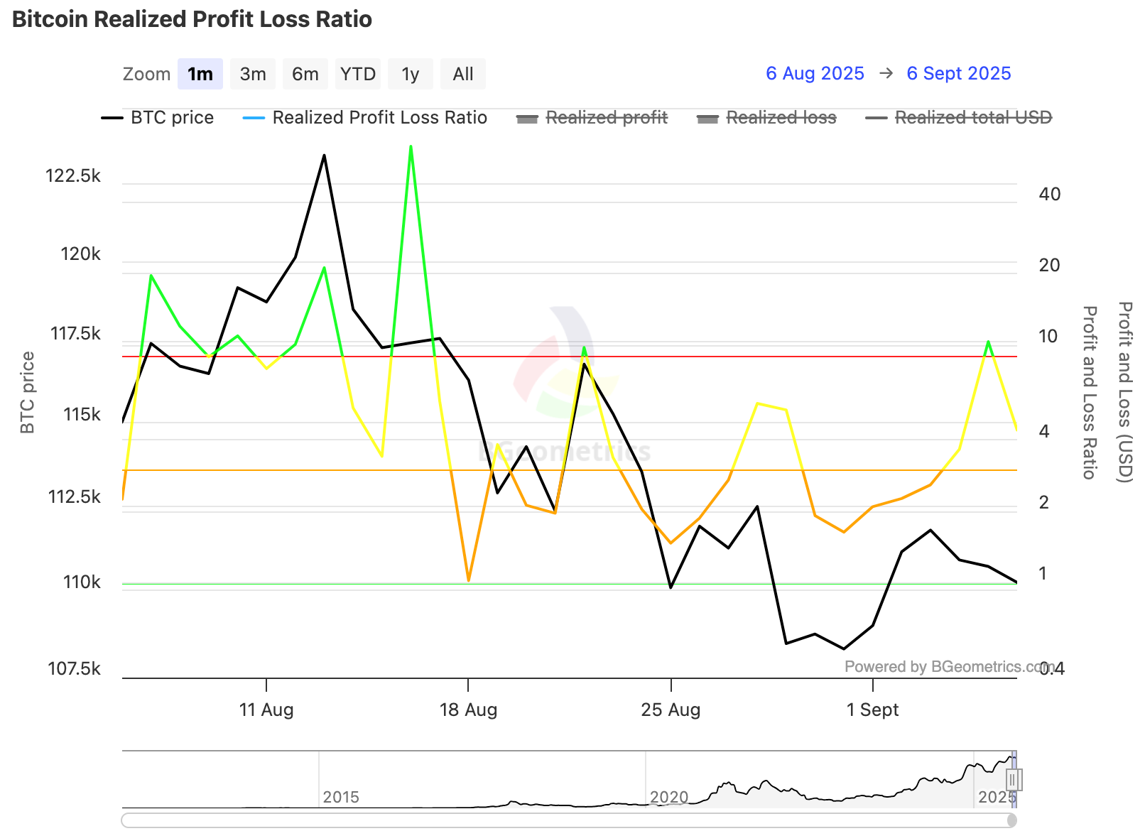
When the ratio stays above 1, realised profit is outweighing realised loss. That can be normal during a healthy advance if demand absorbs the supply. When the ratio repeatedly spikes while price stalls, it can point to distribution pressure.
When the ratio drops below 1 during a drawdown, losses are dominating. A fast recovery back above 1 while price stabilises can suggest that loss realisation has been absorbed.
Do not read one spike in isolation. The better read is whether profit or loss remains dominant across several sessions or weeks.
2. Long-Term Holders Versus Short-Term Holders
The cohort split matters because not all realised behaviour carries the same message. Short-term holders often realise profit or loss more frequently. Long-term holder movement tends to carry more cycle information because older supply is usually less active.
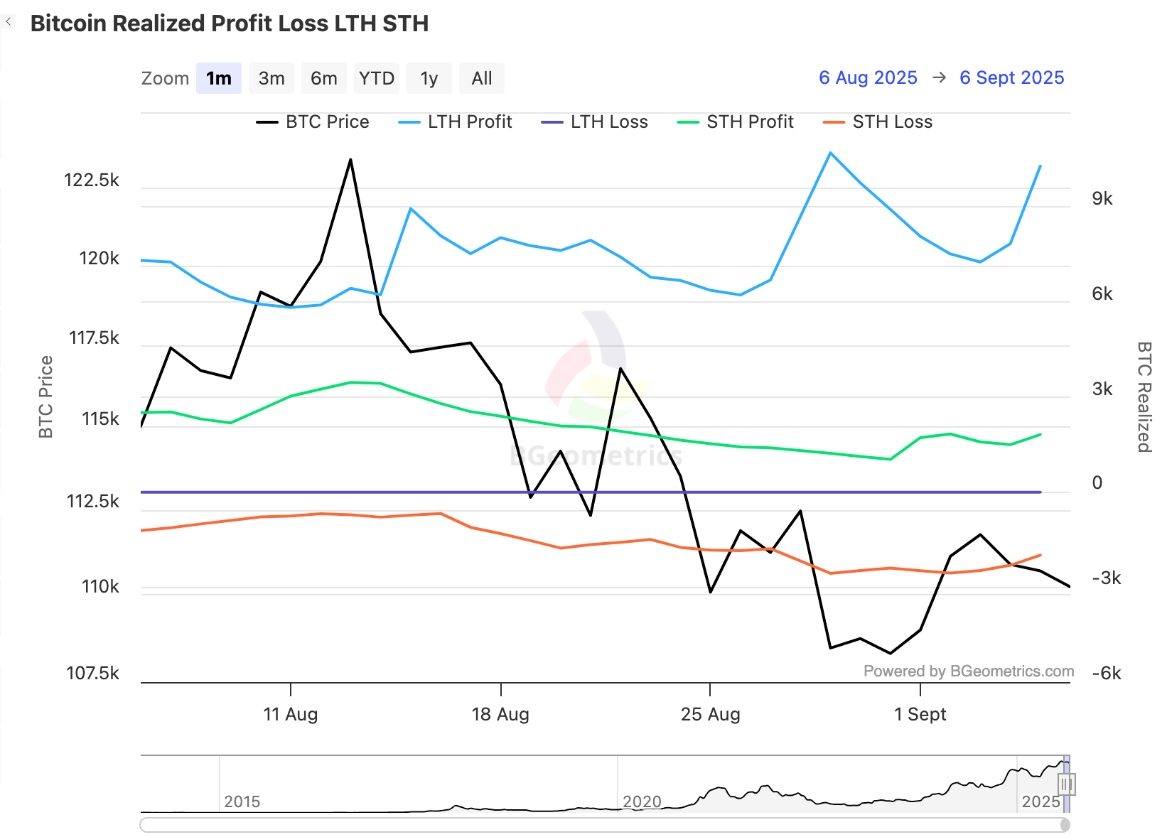
Rising short-term holder profit with modest long-term holder profit can be part of a normal trend. Recent buyers take profit while older supply remains steady.
A jump in long-term holder profit while price fails to advance is more important. It can show older supply distributing into strength. Persistent long-term holder loss is rare and usually appears in more severe stress regimes.
3. Net Realised Profit And Loss
Net Realised Profit and Loss, often shortened to NRPL, nets realised profit against realised loss. It shows whether the period closes in surplus or deficit.
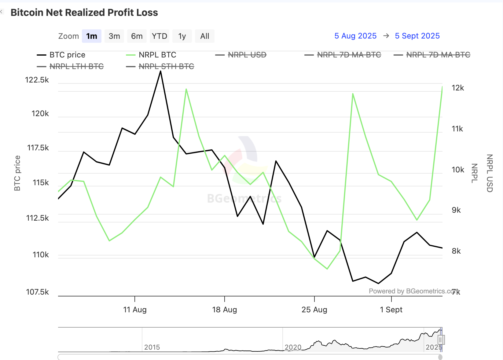
Positive NRPL during price strength is normal. The warning comes when large surpluses persist but price stops making progress. Negative NRPL during drops can mark capitulation, especially when selling pressure starts to fade and price begins stabilising.
What Capitulation And Euphoria Look Like
How To Use Realised Profit And Loss With Confluence
Realised profit and loss are most useful when combined with other on-chain tools. The metric shows what holders locked in. Other tools help explain whether the market is absorbing that behaviour.
SOPR
SOPR shows the average profit or loss multiple on spent coins. Realised profit and loss show the total magnitude being locked in. Together, they help separate small profitable spending from heavier distribution.
Realised Price Bands And MVRV
Realised Price Bands show where price sits against important cost-basis levels. MVRV Ratio helps frame whether market value is stretched relative to realised value. This adds valuation context to the realised profit and loss read.
CDD, VDD And URPD
CDD and VDD help verify whether older coins are driving the move. URPD helps identify cost-basis clusters that may react when price revisits them.
Do not turn this into a single-metric call. Realised profit and loss can show behaviour clearly, but the interpretation depends on cost basis, age bands, exchange flows, and price acceptance.
A Simple Workflow You Can Reuse
- Start with the realised profit and loss ratio. Is the balance favouring profit or loss, and is that persistent?
- Open the cohort split. Is the behaviour coming from short-term holders, long-term holders, or both?
- Check NRPL. Is the market closing the period in surplus or deficit?
- Cross-check SOPR and realised price bands to judge absorption and cost-basis context.
- Use CDD, VDD, and exchange netflows to check whether old coins or venue flows are confirming the move.
Realised Profit and Loss feeds the Absorption and Spending score inside the Bitcoin Barometer. See where absorption and spending sits in the current cycle.
See the Bitcoin Barometer →Mini FAQs
This content is for education only and does not constitute financial advice. Crypto assets are volatile and you can lose money. Always do your own research and consider your risk tolerance before making any investment decisions.


Discussion